
One common outcome we often see with businesses that have recently adopted *Notion is what we sometimes refer to as the “Craigslist Effect”.
Does your space look something like this, with grouped lists of links to pages?
Okay, yeah, the pretty icons and colours help, but organizationally… is it really that different from old faithful craigslist.org here?
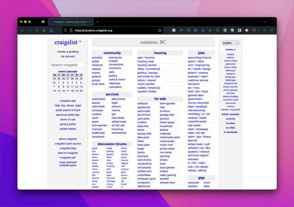
This type of organization is just like what you do in Google Drive: category groups (ahem, folders) that are then—if we’re lucky—alphabetized.
There’s a problem with this type of organization; the one where you’re adding pages in an ad-hoc fashion and attempting to organize them within some sort of container: the user either has to read the page to know what options are available because it’s not easily scannable or click around to see if a page contains the information they are looking for. This adds a small cognitive burden for the user that increases with each click as these moments add up.
This type of organizational methodology leads quickly to what I think of as “search-based design”, i.e. users who are unfamiliar with your organization schema will often have to search to find what they’re looking for. That might mean using Notion’s Search modal to search the entire space or it might mean simply hitting cmd/ctrl + f on a Notion page to find the exact page or database for which you are looking.
In these types of workspaces, we don’t have a clear understanding of what is important to the company and what is important to the “users” of the space. Everything has the same weight and hierarchy, therefore, “nothing” is important.
Iterating on Organization
We reinforced this phenomenon in a live-training in our Business Ops section. In this simple example, we ask:
Design your Business Hub so it passes the “Stranger Test”. Could a stranger navigate your space with ease?
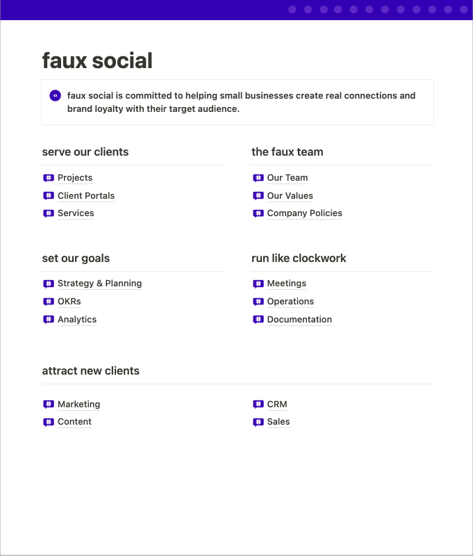
In order to demonstrate a procedural improvement for organizing a workspace, we started with a fake social media company called “faux social”.
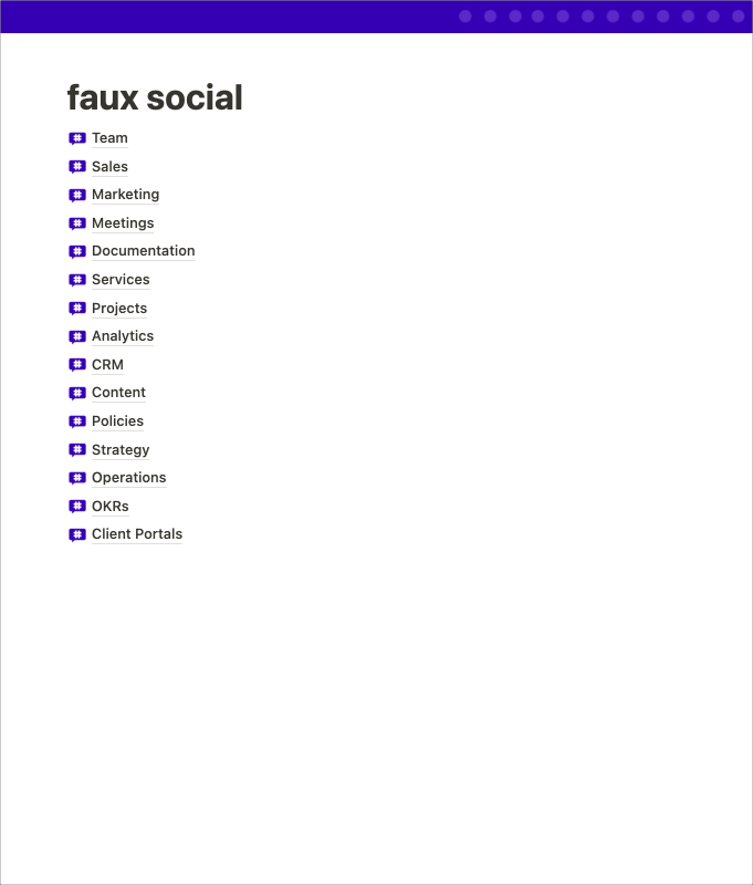
Here we see our “Craigslist Effect” space. It’s simply a list of pages or databases. It’s made even worse by every icon being exactly the same. It’s not even organized alphabetically; the absolute horror!
Next up, we used some headers to better organize the databases into operational categories:
We can already see things starting to shape up here. Even giving a pages some simple headings immediately makes it more clear what our goals as a company might be.
Finally, to round things out, how about making things more explicit?
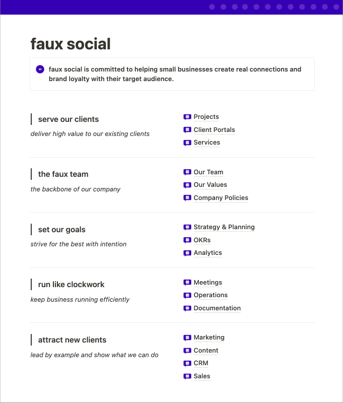
Now we know what each of those operational functions are intended to do. This might help another Notion Architect answer the most important question in Notion workspace design: Where does this go/belong?
What other questions we might ask about this space?
Even with the improvement, it’s still feeling pretty craigslist-y! Nothing is active. How do I know what’s going on at the company? There’s really nothing obvious for me to do here except… browse?
What else might we ask about the design here?
“What actions can I take?”
It appears that I can manage projects, perhaps read into our team’s SOPs, and maybe even take some meeting notes. Could that be more explicit? Could I add some workflow based pages into the space?
Perhaps instead of just “Projects” there’s a workflow-specific Page called “Start a new project”. This page might have linked databases that help instruct participants on how to:
- Add a new Client
- Add a new Project and connect it to the new or existing Client
- Attach Services to it
All of this can be designed around the documentation on how to do such things. Perhaps you might even bake a lot of this into a Project template? What can we do to make that “Serve our clients” area be more action-oriented?
“What’s recent? What’s current?”
The final version, while demonstrably better than the first, still doesn’t give me an insight into the day-to-day operations of the company. It feels like a stagnant snapshot. Could we use linked database to:
- Pull in the latest meeting notes?
- Display our active projects in a timeline view?
- Display the last month’s revenue or sales pipeline?
Dashboards can be a great way to display activity from across the organization and work with multiple data-points on a single page, rather than having to hop into and out of different databases to gain insights.
“What’s in it for me?”
What of this page is for me vs someone else in the company?
Does it make sense to have all of this on one page? Are we mixing information about our company with operational details? Is everyone at the company involved in attracting new clients? Perhaps that CRM and Sales data needs to be private?
I might suggest taking each of those 5 groupings and making a dashboard for each operational slice. Thinking about action-oriented spaces, perhaps we could break our page down into 5 different dashboards:
- Project Management – serve out clients
- Our Company – the faux team
- Goal Planning – set our goals
- Operations – run like clockwork
- Biz Dev – attract new clients
Each of the pages and databases could be tucked into these dashboards. This would make our company dashboard a lot simpler and this could make it easier to move dashboards and systems between Teamspaces (example: maybe Biz Dev would actually be in a private Teamspace).
Combating the Craigslist Effect
Here’s another example in similar scope that is a little more explicit about what actions you can take in the workspace.
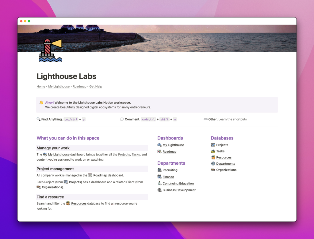
Here we’ve utilized a similar data-set, but we’ve designed an entry-path into our space that guides the user and promotes discoverability.
This page is more clear about what I can do in this workspace (literally “What you can do in this space”) and it appears we have different dashboards for context-specific activities.
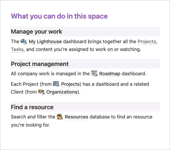
For a new user to the space we’ve shown three actions that they might want to take. We also push them pretty strongly into the “My Lighthouse” page, which is a view-only “me page” that displays content throughout the system. This way, newer Notion users can avoid jumping around to different databases and operate solely from a personal dashboard.
ℹ️ “me” page A page in a Notion workspace that pulls in content throughout the space and filters it using a Person property with the filter set to Me. Often set to “View only” permissions with the Linked Views of the Databases nested in the page set to “Can edit content” permissions.
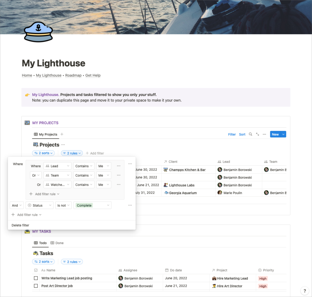
Lead, Team member, or they’ve added themselves to the Watched by field [an internal favourites system])Bonus: this page could be locked down so the user can only interact with the data on the page but not break any of the infrastructure the “Notion admins” have defined.
Also in the Lighthouse Labs example, we’ve defined a simple navigational element using a synced block that can be added to each of our primary pages in the Teamspace. This type of navigation and consistent layout across multiple dashboards can make Notion feel like more of an application with “tabs”.
This way you can group related content into smaller dashboards instead of having a dump of databases and pages on a single page.
Why is this so hard?
One of the strongest challenges of *Notion is that it allows you to design open-ended solutions. It’s a lot like building a website, and, as such, requires you to ask questions such as:
- What are my co-workers coming here to accomplish?
- How can I make this easy to submit information?
We’ve been building websites and apps for almost two decades at Oki Doki, and now, with our Notion architecture, we utilize a lot of the same methodologies in designing workspaces:
- Information architecture
- User interviews
- Data modeling
- Form design
- Visual design
The above skill-set should be a strong indicator that building and maintaining a successful Notion space goes well above and beyond “learning Notion.”
Effective workspace design considers:
- How do users move through the workspace?
- How do we introduce new users to the workspace?
- What can and can’t users see?
Creating effective hierarchies:
- The more important something is, the more prominent it should be.
- Visually group things that are logically related.
- Design for scanning, not reading.
- Use visual nesting.
- Keep additional info tucked away unless needed.
“Okay, great”, you say, “we need better organized structures, but ain’t nobody got time to build that—what about templates?“
Assuredly, templates can help us with initial organization, but in our Notion consulting and training, we see strong patterns that folks believe that real-world workflows and company dynamics can be mapped to templates.
The reality is that the specific principals and heuristics that work for your company fall out of observation, doing the work, and building for discovery.
This takes time and consistent effort to do right.
Even with templates, Notion takes time to unfurl within your organization.
In the end, it’s worth the effort to treat your Notion workspace like the major digital product that it is. That is to say: yes, use templates! But understand that templates are but a small part of a larger, more integrated system.
[*For full disclosure, I’m a Notion Partner, so when you sign up with my link, you also help support me and my content!]
 Notion tips in your inbox